

DOTTY CHUNK | ドッティ チャンク

Project Name :DOTTY CHUNK | ドッティチャンク
Client : 株式会社なにわ屋
Category : Cookie Shop / Retail
Location : 大阪市北区中崎西3-1-5
Design : TODAYS Inc. / 岡田 大輔
Constructor : ANTSCREATE / 安岡 一樹
Lighting : TODAYS Inc.
Photographer : hanada photograph studio / 國弘 ひかり
concept:
A Little Cookie Kingdom
大阪・中崎町のクッキー専門店「DOTTY CHUNK」の店舗デザイン・店舗設計を担当した。
NYのクッキーレシピに着想を得たブランドコンセプト「A Little Cookie Kingdom」を、限られた7.3坪の空間に立体的に表現した。
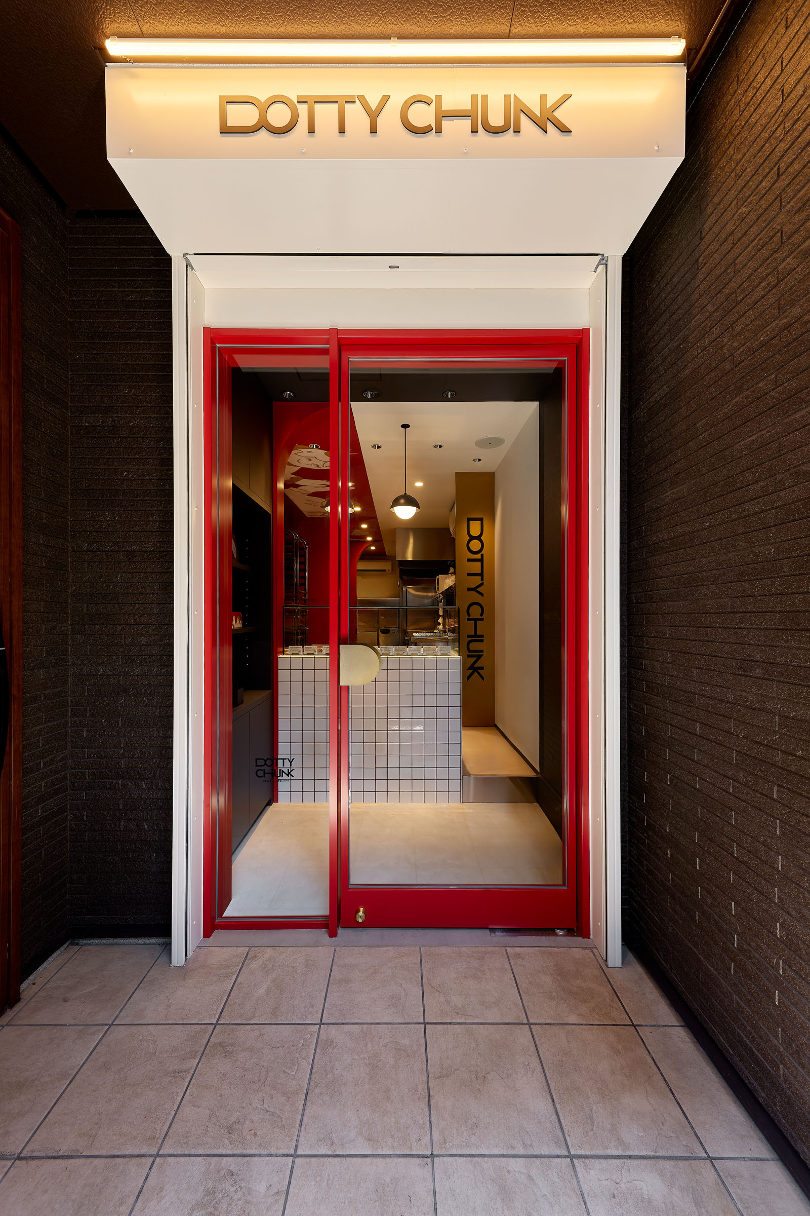
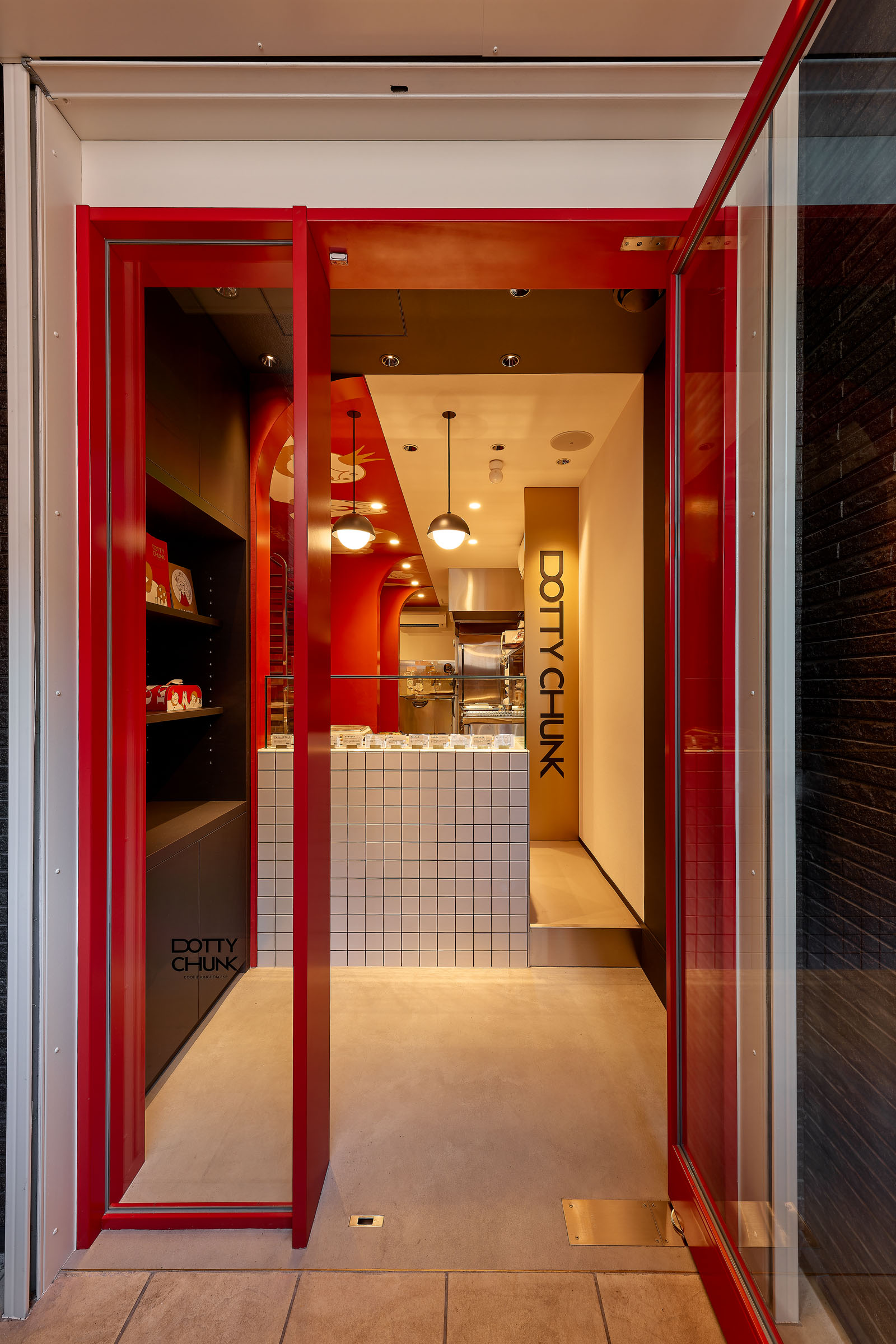
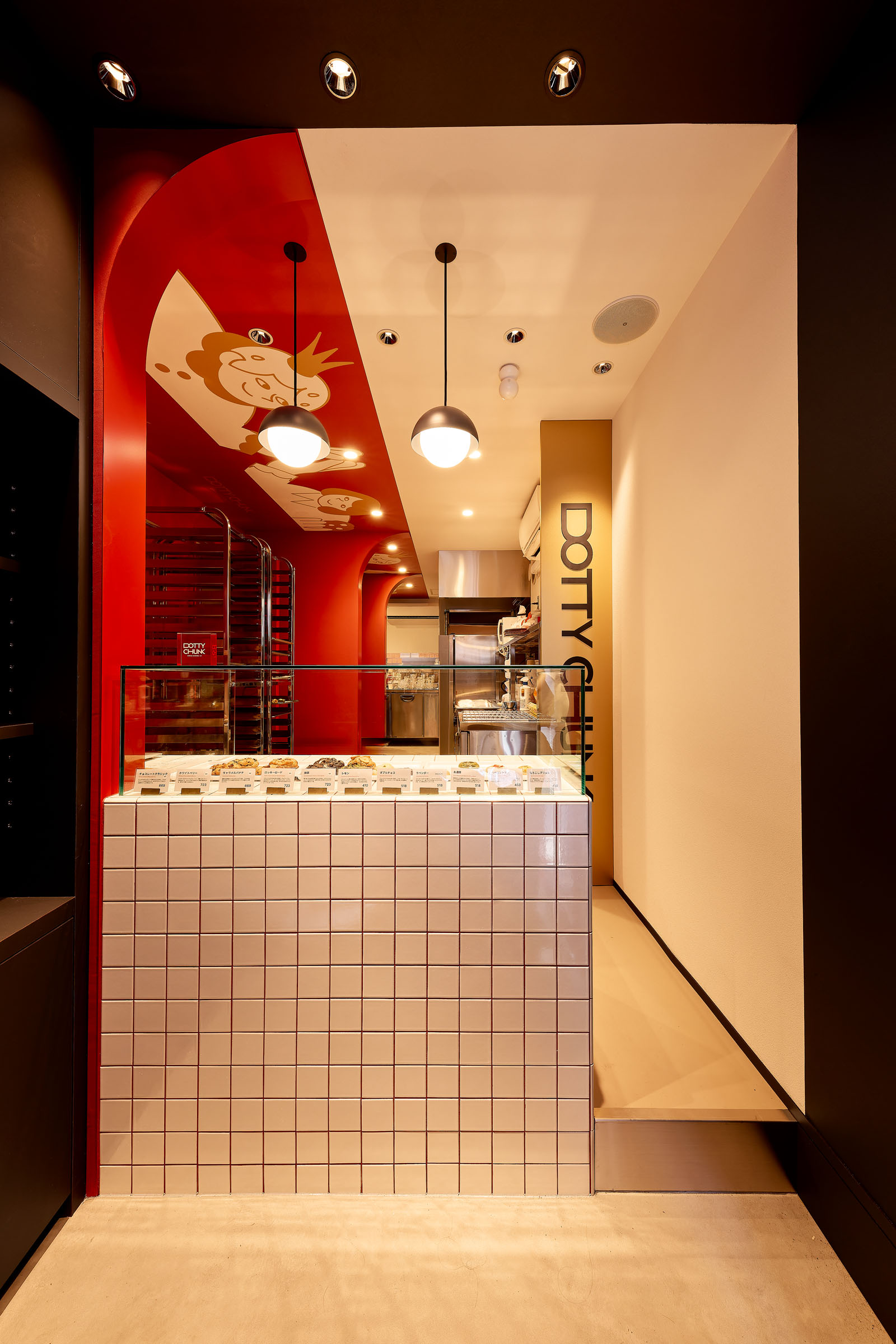
空間の象徴となるのは、店内の奥へと連続するテラコッタレッドのアーチ。
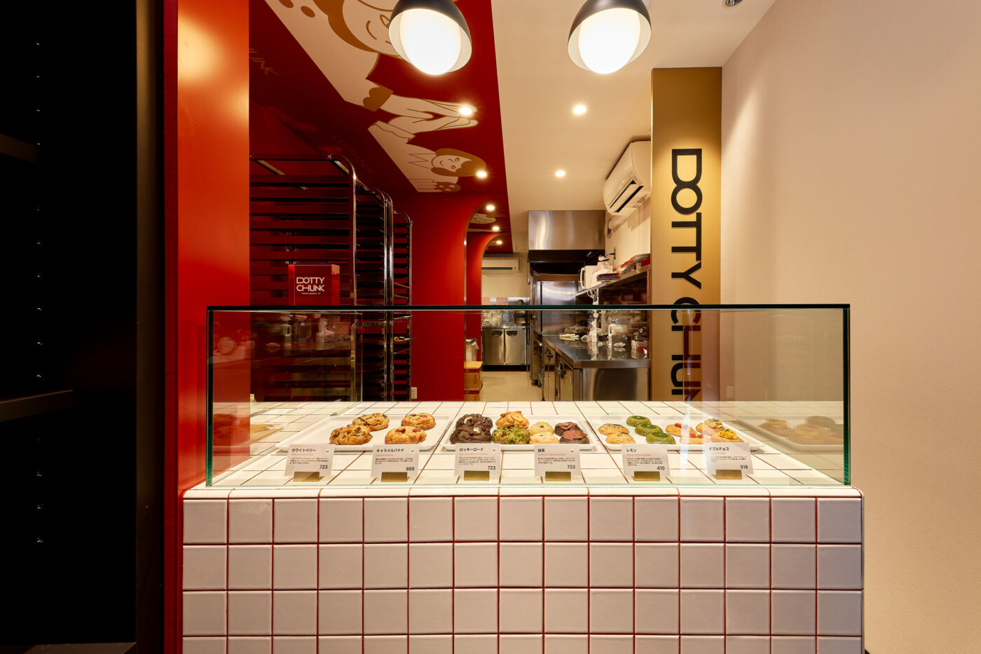
入口から厨房へと緩やかに連なるアーチが視線を導き、コンパクトな空間にリズムと奥行きを生み出している。それは、街からブランドの世界へと足を踏み入れる「ゲート」としての役割も担っている。
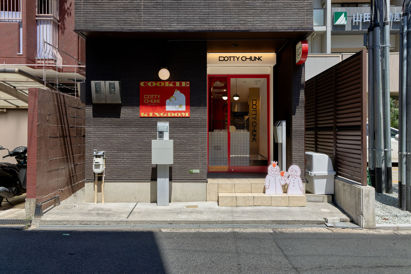
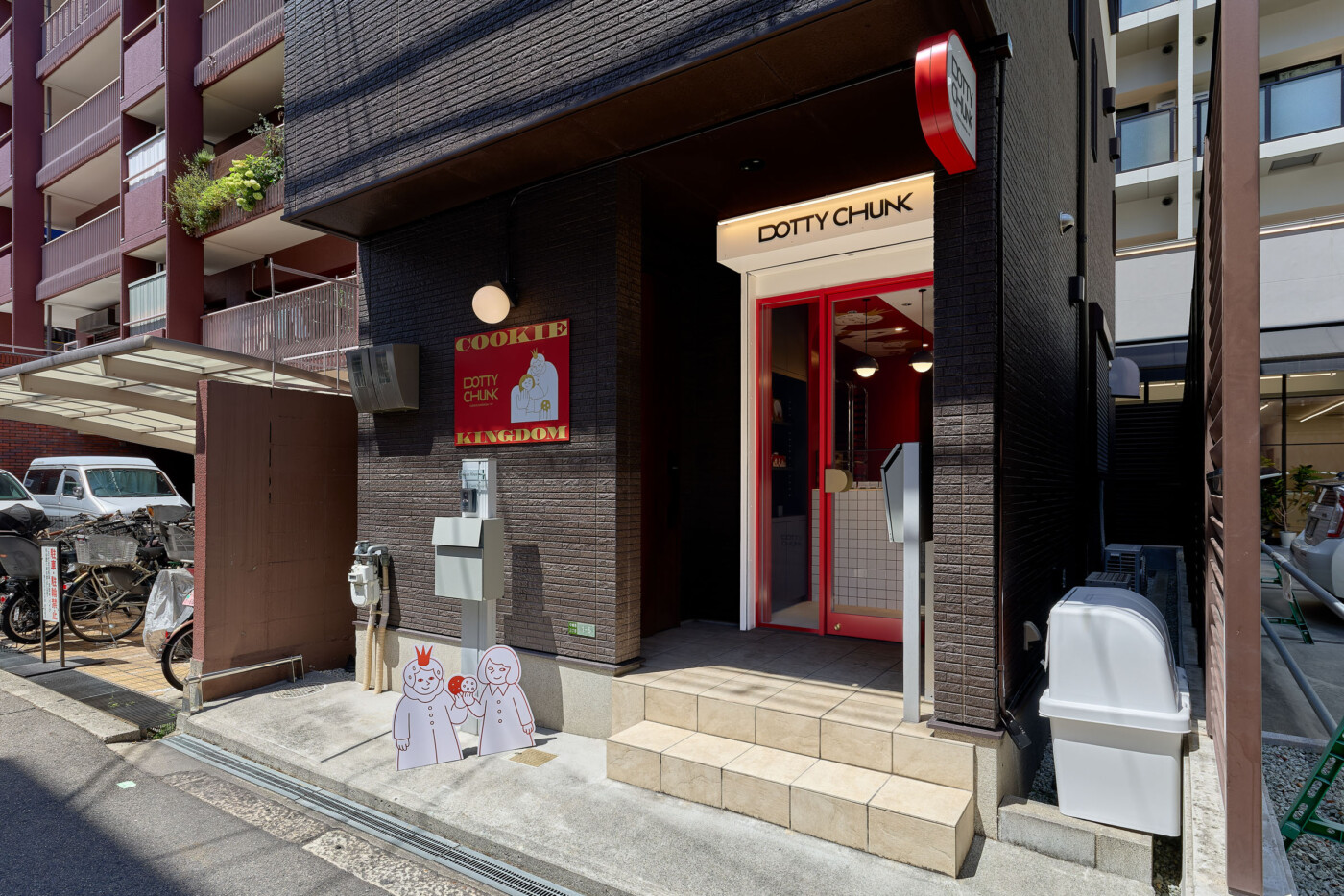
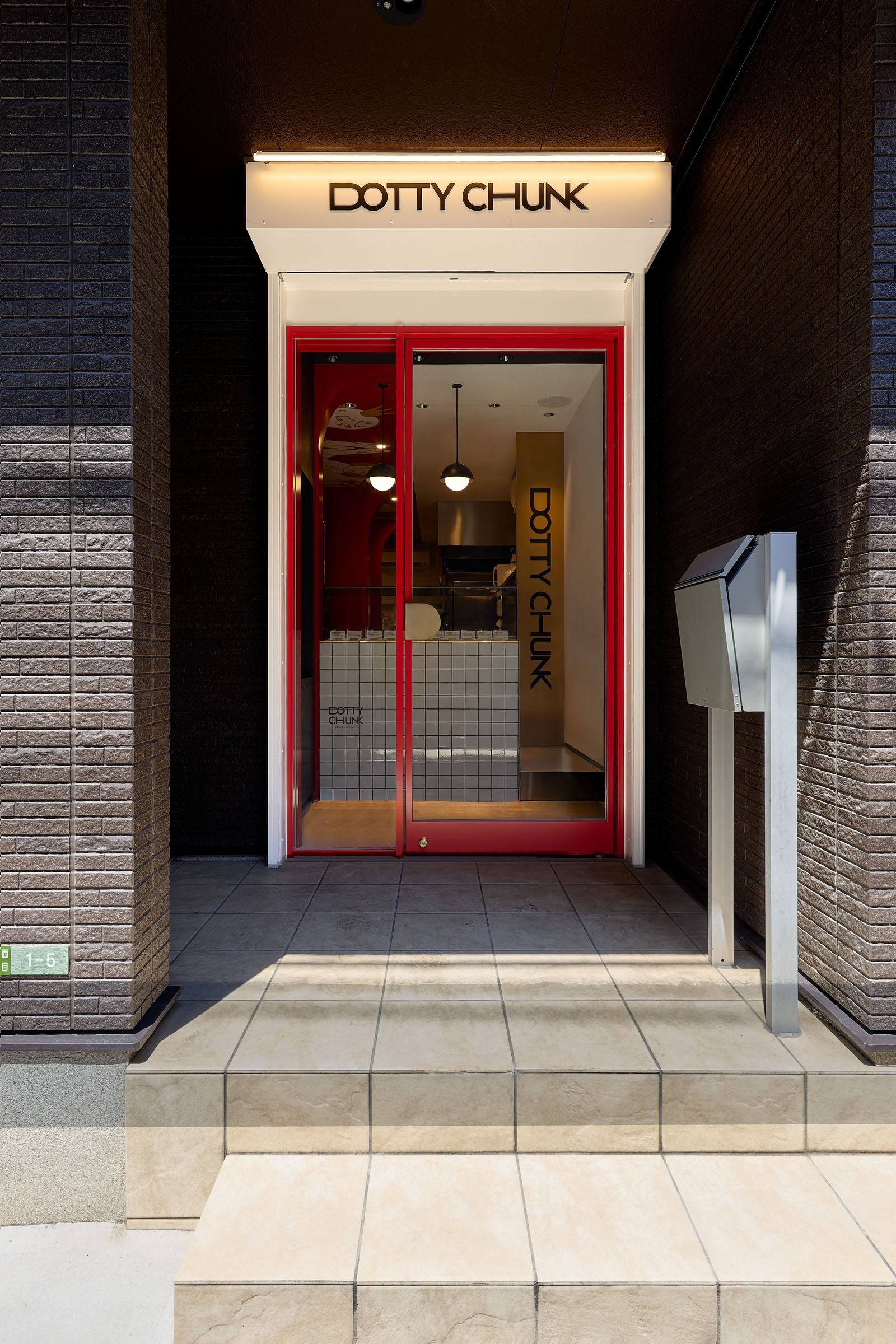
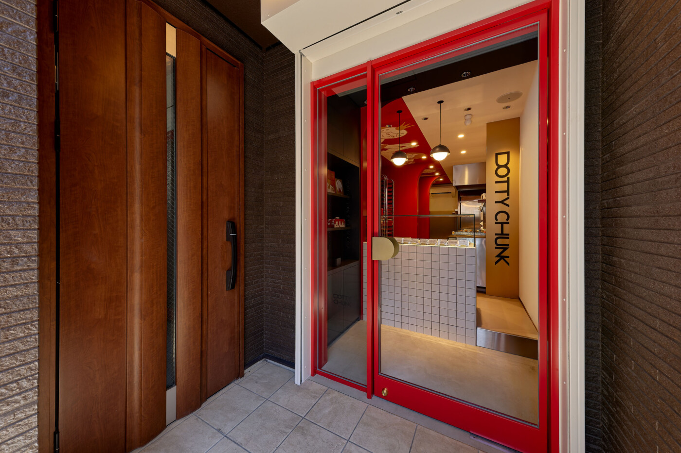
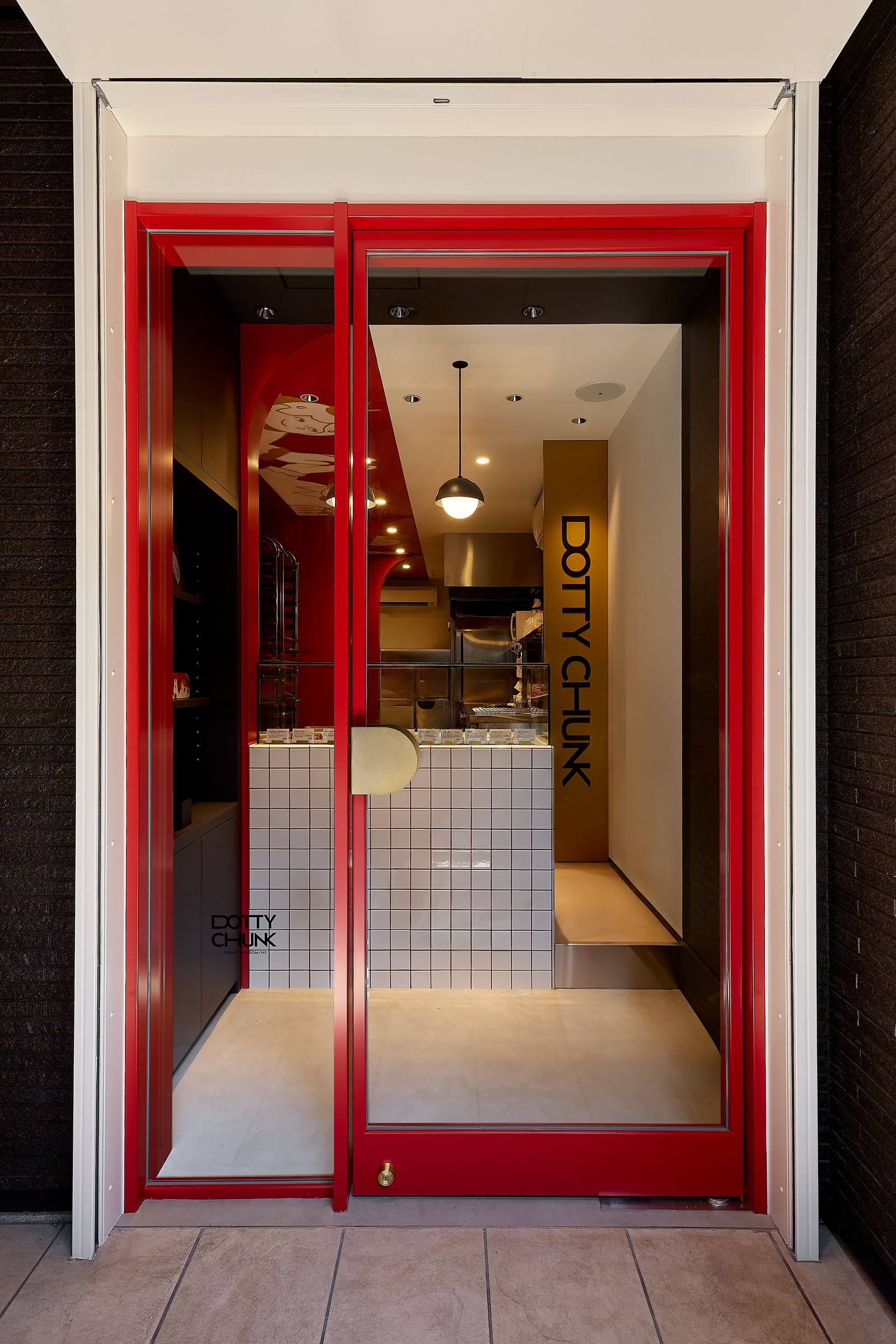
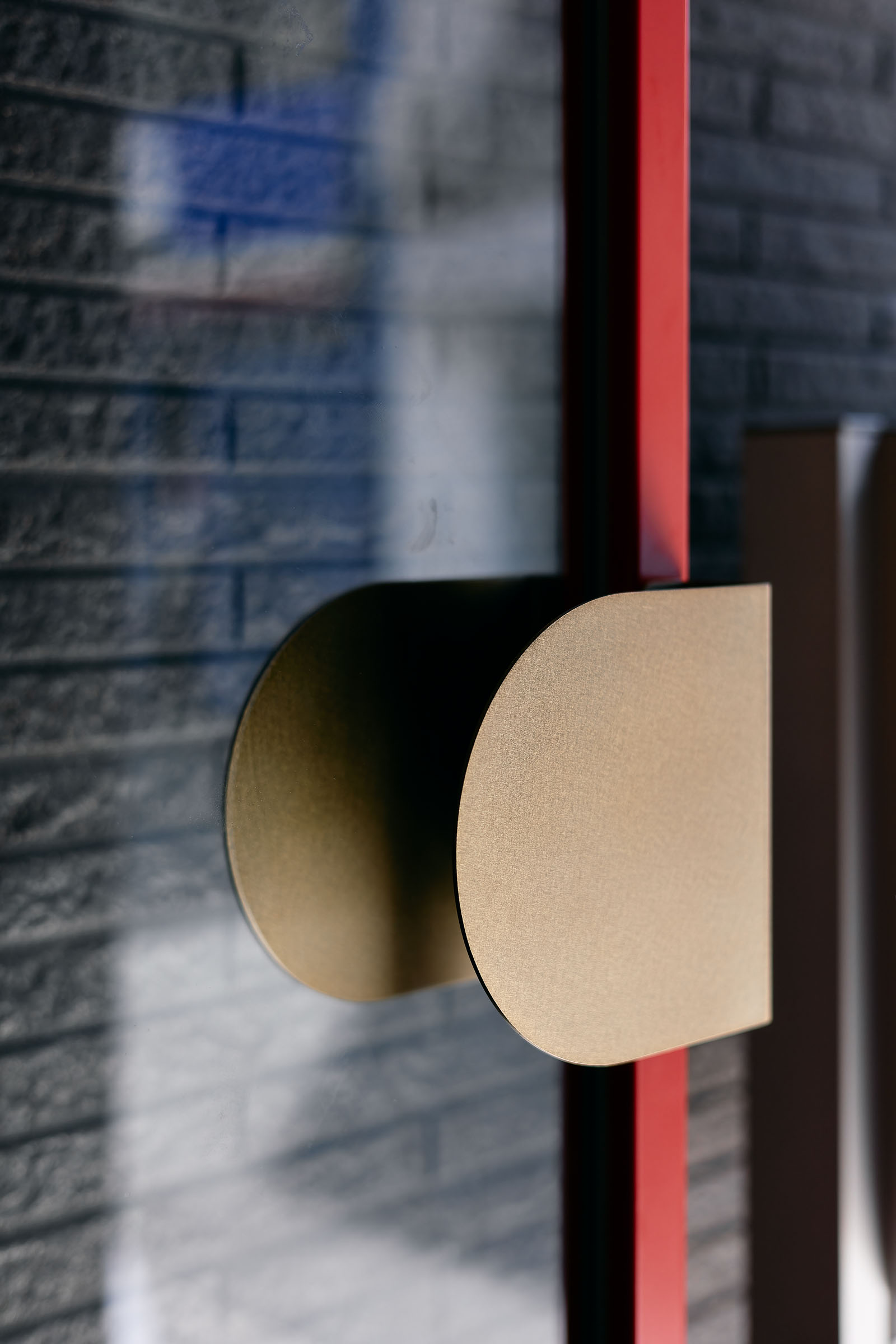
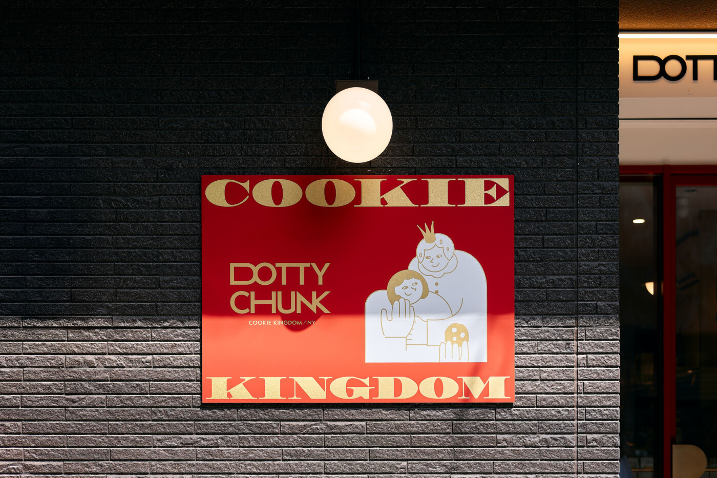
ファサードには鮮やかなテラコッタレッドの細いフレームと大きなガラス面を採用し、外部から店内の色彩や商品が自然と視界に入る、開放的な構成とした。
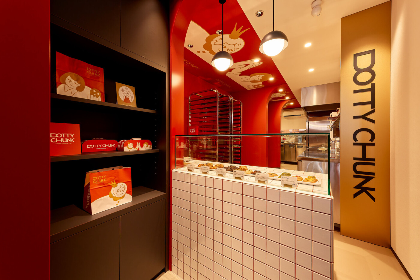
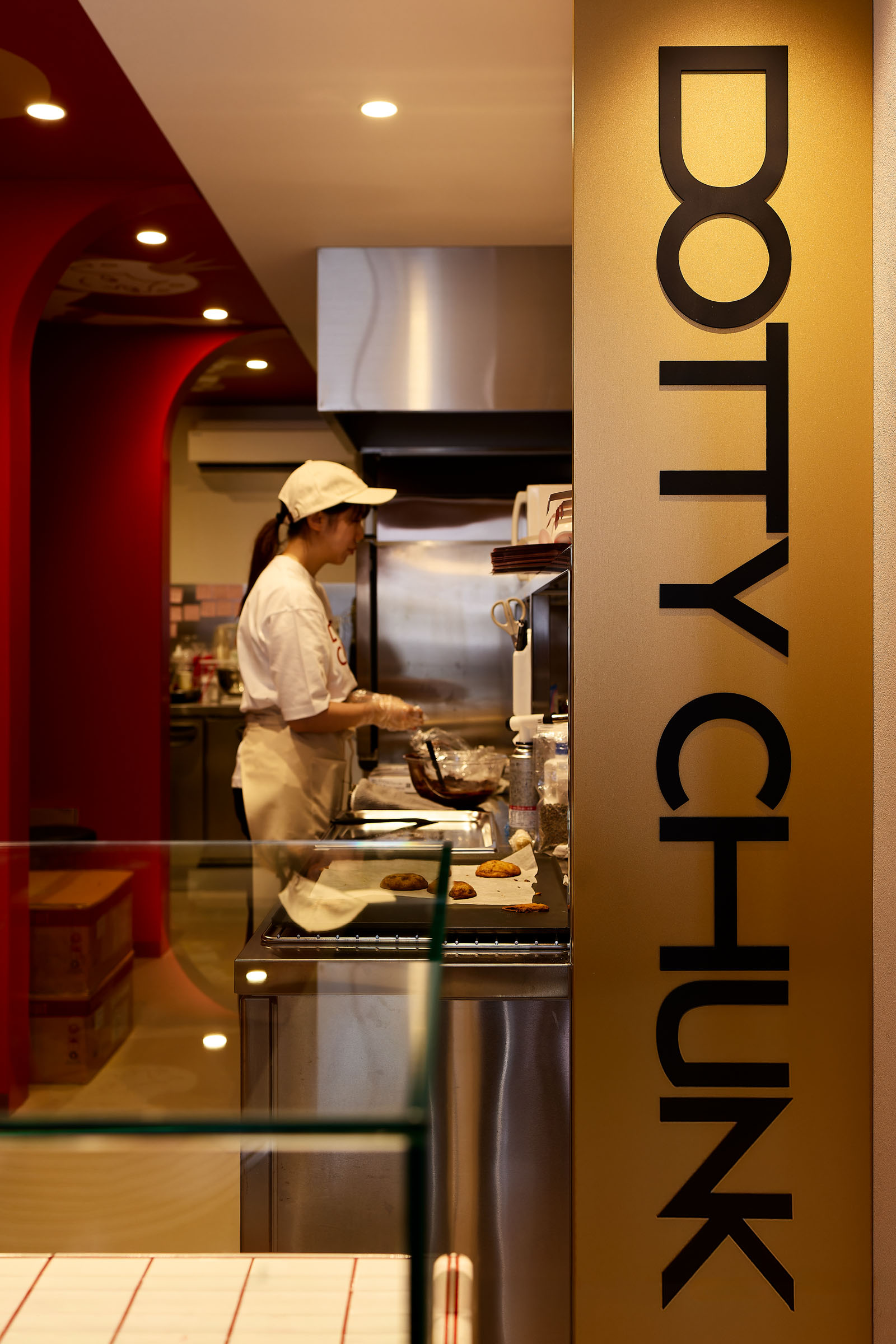
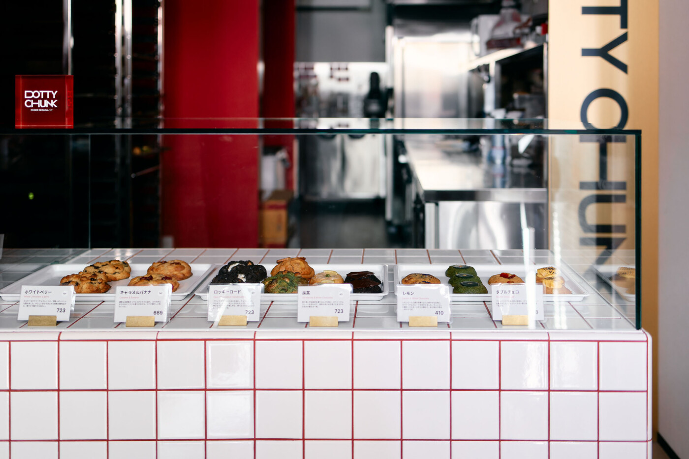
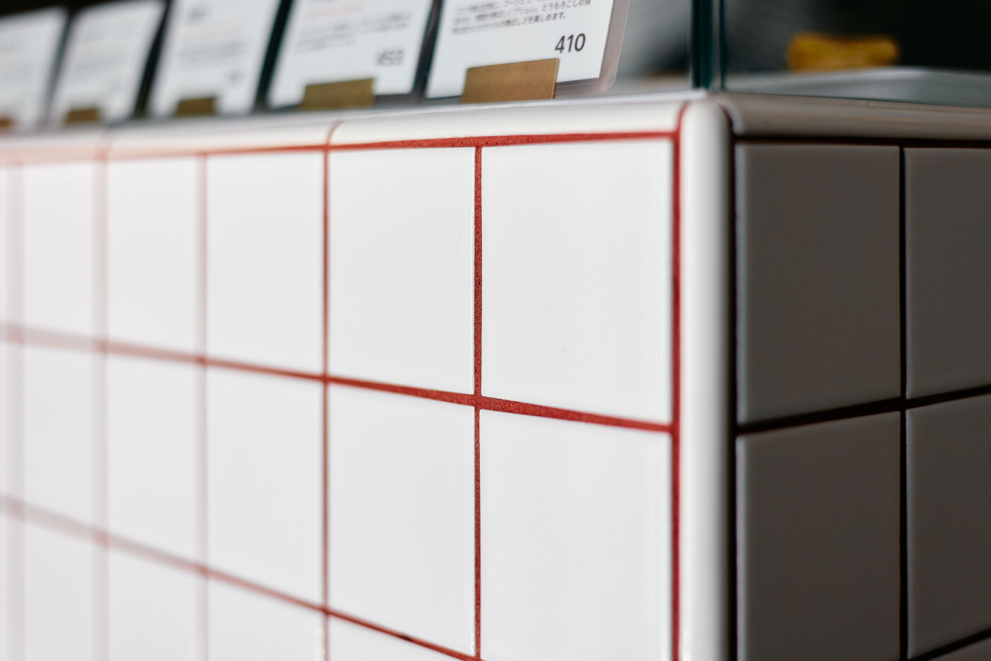
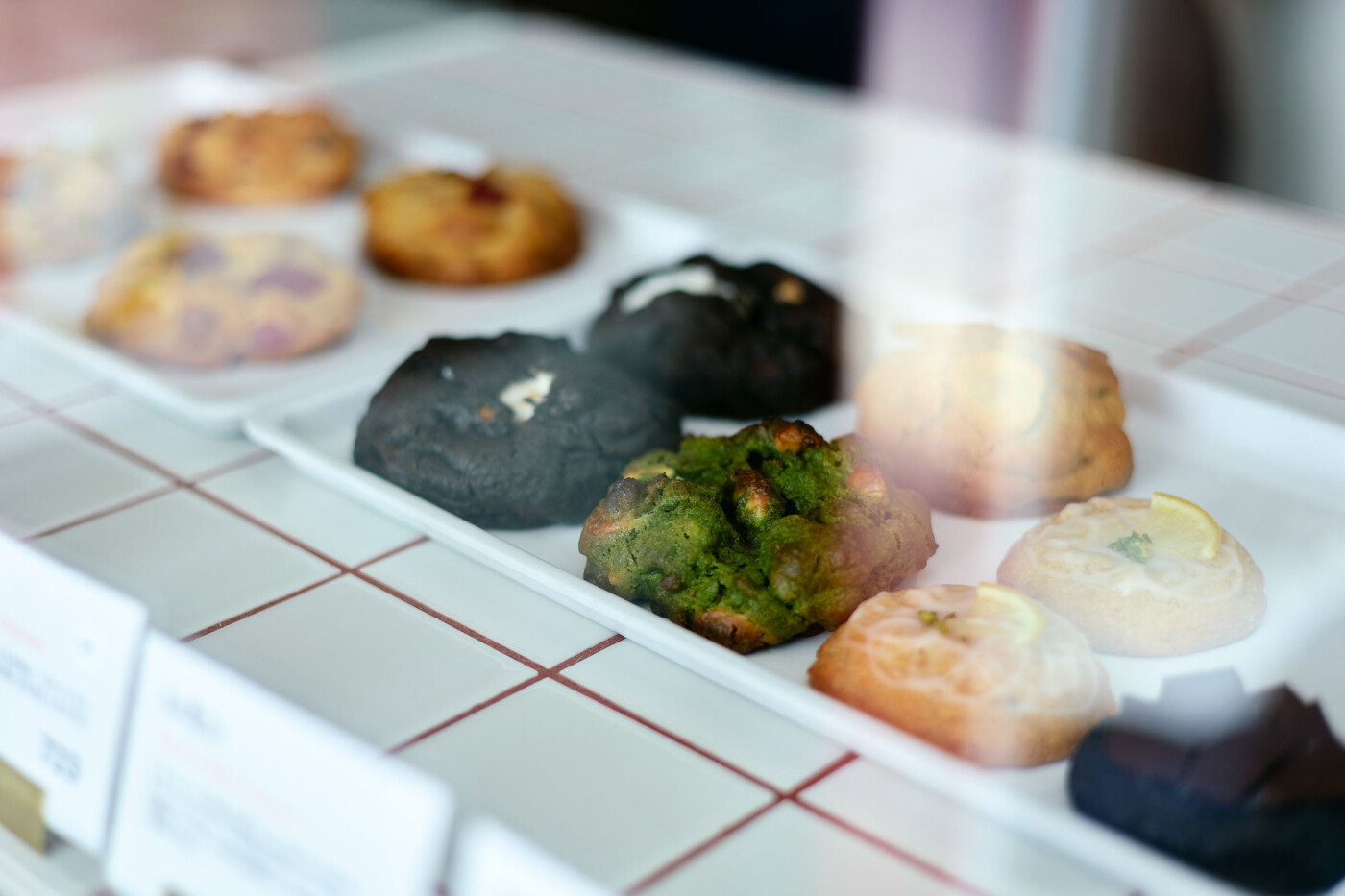
ショーケースは白いスクエアタイルに赤い目地を組み合わせ、ブランド名の「DOT」を想起させる小さなグリッドを反復。テラコッタレッド、ホワイト、ブラックを基調とした空間にゴールドをアクセントとして加え、ブランドの楽しさの中に上質さを重ねている。
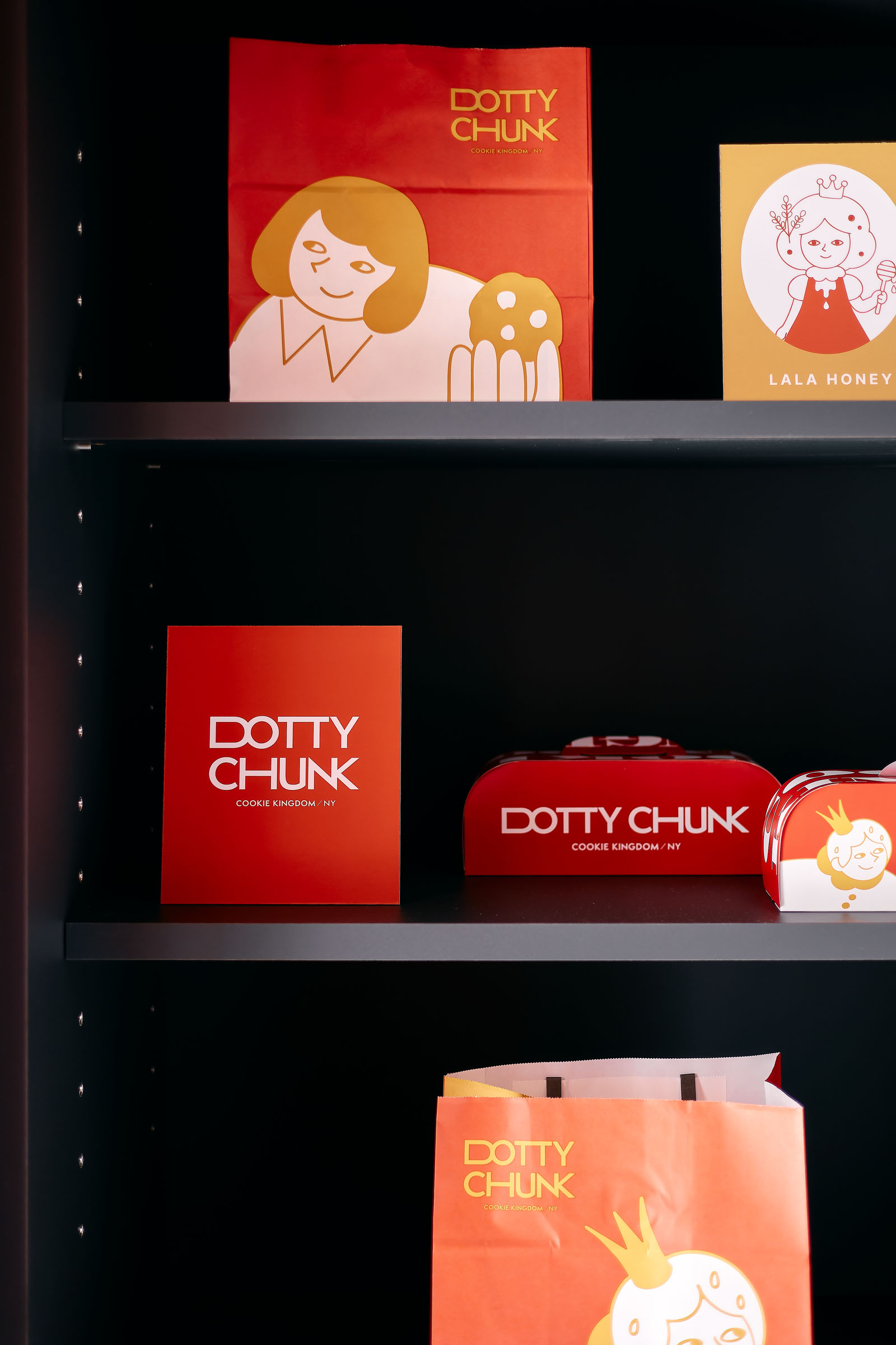
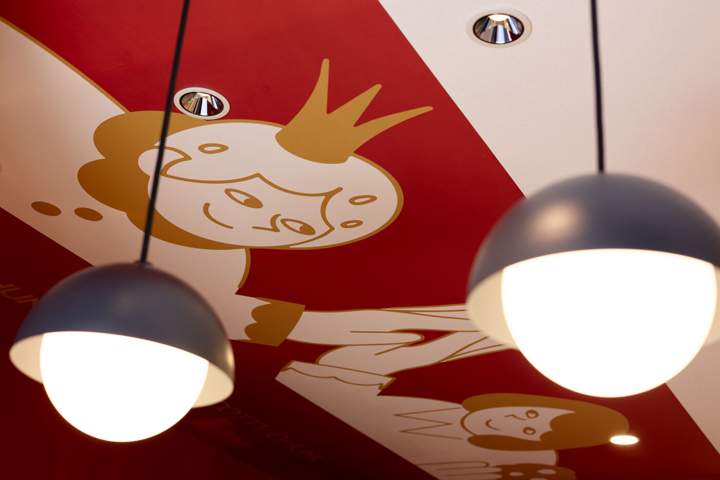
さらに、天井にはブランドキャラクターのグラフィックを大胆に展開。商品を選ぶ、見上げる、奥へ視線を向けるといった店内での動きに合わせて、グラフィックや色彩、アーチが次々と現れる構成とし、小さな空間の中に発見のある体験をつくり出した。
クッキーを選ぶ時間そのものが、このブランドの物語に触れる時間となるように。
「小さなクッキーの国」を空間として体験できる店舗を目指した。
DOTTY CHUNK is a specialty chunky cookie shop inspired by authentic New York-style cookie recipes.
The interior translates the brand’s concept of “A Little Cookie Kingdom” into a spatial experience within a compact, narrow footprint.
The defining feature of the space is a sequence of terracotta-red arches extending toward the back of the store. Gently connecting the entrance to the kitchen, the arches guide the eye through the space while creating rhythm and a greater sense of depth. At the same time, they act as a series of gateways, marking the transition from the street into the imaginative world of the brand.
The façade features slender, vivid-red frames and expansive glazing, creating an open and inviting presence that allows the colors, atmosphere, and products inside to be seen naturally from the street.
The display counter is finished with white square tiles and red grout, forming a repeated grid that subtly references the “DOT” in the brand name. Terracotta red, white, and black define the overall palette, while gold accents add a refined quality to the brand’s playful character.
Bold illustrations of the brand’s characters extend across the ceiling. As visitors choose cookies, look upward, and move their gaze deeper into the store, graphics, colors, and arches gradually unfold, creating moments of discovery within the compact space.
The aim was to make the simple act of choosing a cookie feel like stepping into the story of the brand—creating a place where visitors can experience “A Little Cookie Kingdom” through space.
店舗デザイン・店舗設計のご相談
TODAYS Inc.では、大阪を拠点に飲食店・物販店・サロン・オフィスなどのインテリアデザイン・設計を行っています。 新規出店や改装のご相談を承っています。
